Typography
We use Helvetica or Arial in all VTT’s materials and applications. Use Arial in normal office applications, such as Word, Excel and PowerPoint files, and when Helvetica is not available. Don't use Calibri or any other fonts.
Font styles and usage
Texts are preliminary left aligned and with the right side ragged. As an exception, for example in social media posts, centered visualisations can be used.
Avoid writing with capital letters only! Readability is reduced with all caps because all words have a uniform rectangular shape. Therefore, text in all caps is used sparingly and only in selected brand level campaigns.
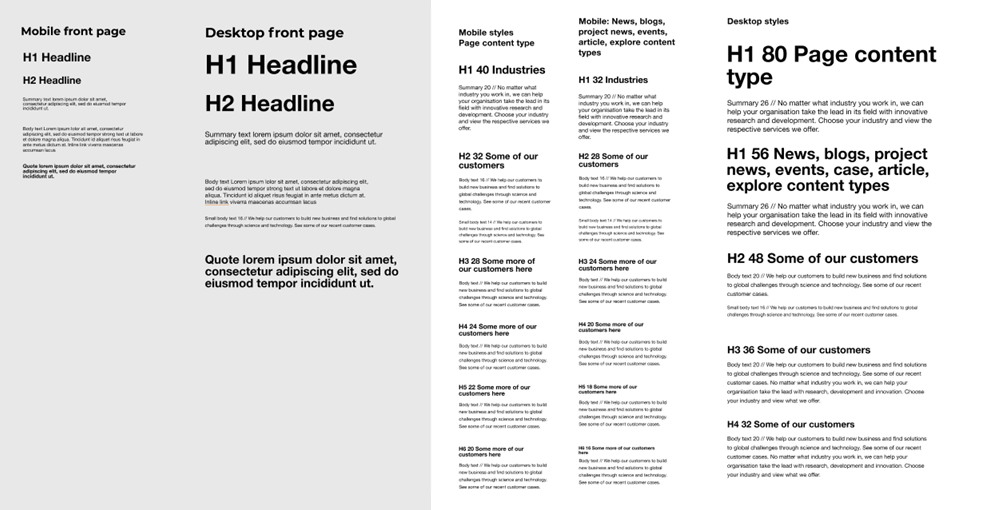
Use text styles coherently in your content to make it understandable and accessible for the reader. Heading styles are used for creating a structure for the content and run from H1 to H5, but typically two title levels are used: main title (H1) that is used only once in the content and first level subtitles (H2). Below are some examples of text styling:
Heading 1
Heading 3
Heading 5
Body text: Include also easy-to-glance elements, such as lists, quotes and bolded keywords. Keep your subtitles short and clear.
Quote style: Let’s take our brand to a new level with the help of these brand guidelines, together!

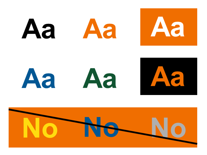
Font colours
Make sure to create enough contrast between the text and the background. Choose VTT's darker colours for light backgrounds and vice versa. We prioritise black copy text on white backgrounds. We use orange in highlights, e.g. in headlines and to highlight something. In order to meet accessibility requirements, please note that when using VTT orange with white the text size must be 18 px (14 pt) and bold or larger, or 24 px (18 pt) or larger.

