Logo and brand promise
VTT logo is the embodiment of the VTT brand. The logo is always boxed-in and the design consists of the letters of our name and a rectangle. Our brand promise guides what we say and how we say it. This is why we use our brand promise together with the logo in all our internal and external communications as often as possible.
Logo versions
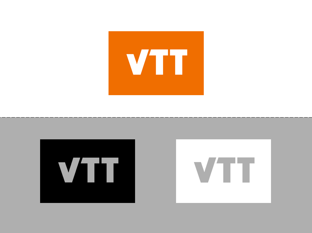
VTT logo is available in three different colour settings. The orange logo with white letters is the primary one. The letters of black and white logos act as a window to the background ("negative black and negative white logos").
The logo should stand out clearly. Pay attention to the surrounding design and background colour to ensure good contrast, and that also the rectangle around the letters is visible.
For videos, we have a standardised animated outro that is used in the end of the videos.
Brand promise
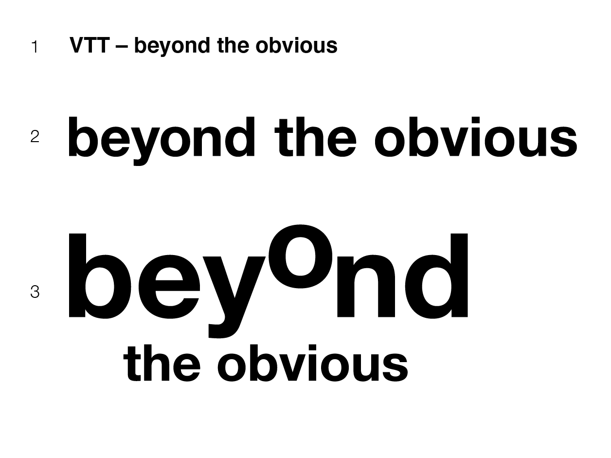
VTT brand promise has three basic formations. In writing and as a written text, separate VTT from the brand promise with a dash (longer than a hyphen) and a space on each side1.
In design there are two brand promises to choose from. You can use either one line wordmark2 or organic brand promise3 depending on the application. Use the wordmarks in black or white in relation to the surrounding design. Never use only the brand promise without the logo, in any design!
VTT outro
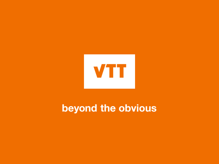
VTT's animated outro is used in the end of videos.
The outro cosists of white VTT logo and brand promise, and it is available with orange or black background.
Logo safety area and placement
VTT logo is placed on the top of the design whenever possible. The logo can be placed either to the left or right side, depending on the application.
To maximise recognition of our logo, a minimun safety area around the logo is the height of the letters VTT. Keep the safety area free from other design elements.
If you use brand promise, place it in the end of the design and in 1/3 size of the logo height, or smaller.
Logo don'ts
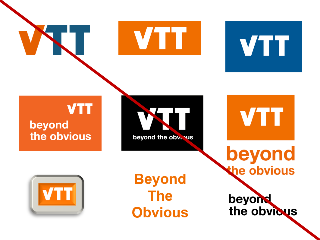
Always use the original logo and brand promise files; never edit, crop or modify them. Don't use only the letters, change colours or the size of rectangle. Don't combine logo or brand promise in a same box, nor use only the brand promise as a logo element.
Logo and co-branding
VTT logo can be used in various collaborative activities only by VTT’s authorised partners. This includes, for example, consortia, ecosystems and jointly funded projects where VTT is a member, strategic partnerships and networks, and event marketing.
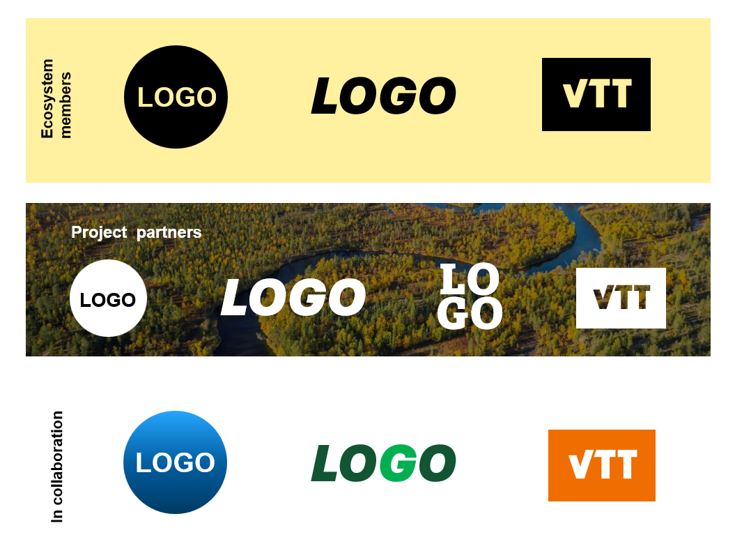
When placing multiple company logos together, ensure that all the logos are presented in a similar colour mode to create harmonious appearance. Typically, the options for logos are a full colour, black or white version.
The size and dimensions of the VTT logo should be proportional to other logos. Aim is to achieve a stylish look and feel, where no logo dominates the others. Also give each logo enough space.
Logo exceptions
The logo is used exceptionally on facades in accordance with local city plan regulations.
