Interactive elements
Interactive elements are actionable and guide the user forward towards the information that they are looking for. Interactive elements can be buttons, links, filters, forms or tags.
Primary button
Buttons enable interactive actions and utilise our brand colours. The default button style is rounded. On white backgrounds we use either orange or black borders and black texts. If buttons are used on a black background, we use orange borders and white texts. Use the primary button style only once per view to highlight the main call-to-action.

Secondary button
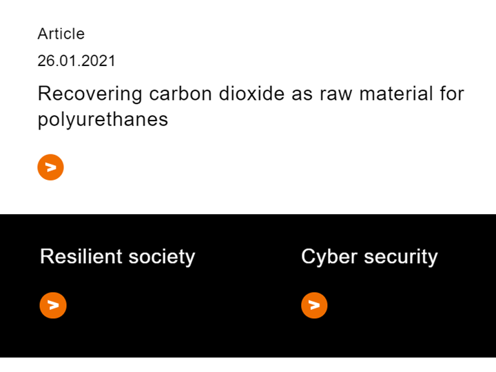
Our secondary button is inspired by the letter V in the VTT logo. The orange, arrow-like, round button guides users towards secondary actions and links. It is ideal for highlighting content when multiple options are presented in a single view. The secondary button works on both white and black backgrounds. The example image shows its use in an article liftup and a service liftup.
Text links
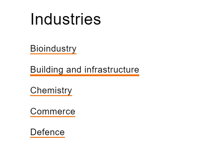
Text links are marked with orange underlining, making them easy to spot and recognize. In hover and active state the underlining is thicker than in normal state. The example below shows an industry listing where the second link is active.
Filters
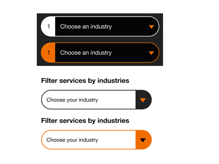
Filters follow our round button style. For filters we prefer browser native dropdowns. If filters are interconnected, numbering is used to advise the user.
Forms
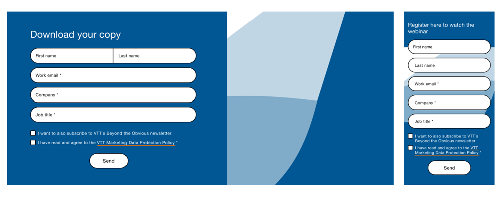
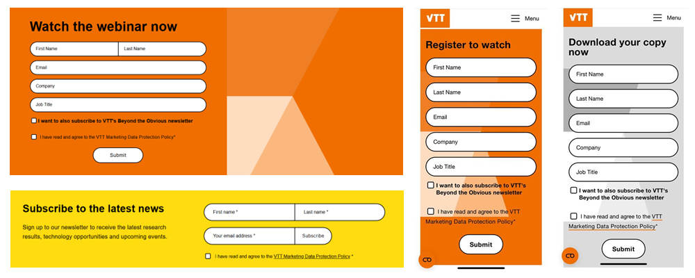
Forms enable data collection, interaction and communication. Forms on the website are created with Drupal Webforms. Our form design is based on simple colour blocks combined with close-up versions of our patterns. There are four different colour themes for download forms (orange, green, blue and grey). Input fields are typically white with black texts to ensure good contrast. Yellow form colour is mainly reserved for newsletter forms and special highlights.
