Brochures and publications
Our brand offers a wide range of options for designing communications materials, publications and other marketing literature. We pay special attention to brand consistency, high quality of the design and accessibility aspects across the applications. Online literature can include hyperlinks, buttons and multimedia, so ensure that they are aligned with our web components. Below you'll find few different layout and use case examples.
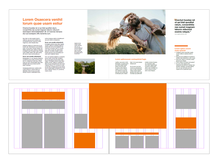
Layout grid
The spreads can be designed in many different ways by utilising our grid system. Always consider the context and user experience when choosing the format. When you create printed materials, choose paper size from A-series and design the spreads so that text and graphics span across multiple columns, and over pages. When designing online documents, create dynamic pages that are easy to read and scroll, even with mobile devices.
Utilise margins and white space, and make sure that you leave enough space around the content to make it more clear and easily understandable. Avoid unnecessary lines in gutters and between columns.
Brochures
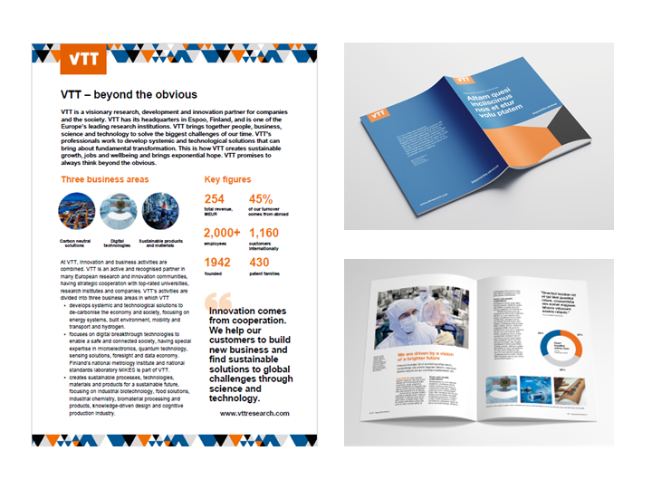
White is the foundation for our documents' content pages, while coloured backgrounds, patterns and images spice up the design, and are the main elements of the front and back cover.
White papers
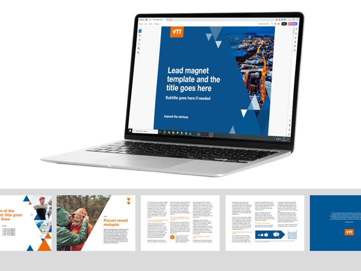
Different white papers are typical lead magnets for marketing, and they should offer valuable, unique insights based on the latest research, focusing on future possibilities. Content is always tailored to the target audience, and relevant to their business needs, showcasing VTT's expertise.
The design is simple yet inspirational and visual, and aligned with VTT's branding. The pages can be designed in many different ways by utilising our grid system, and by varying the use of images and text. Cover page is bold and visual, while simple content slides bring harmony.

Reports
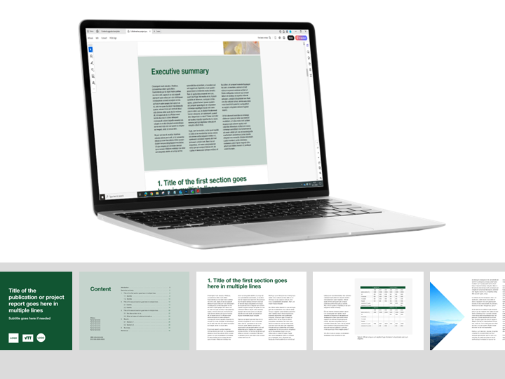
VTT's template can be utilised as a basis for various collaborative reports, scenario studies and publications, if you're looking for a more visually appealing presentation than a simple text-based Word document. Feel free to add other company logos to the front and back cover, and change the colours to achieve the desired end result that suits all parties.
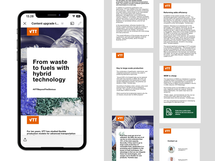
Content upgrades
Mobile-friendly content upgrades are concise versions of longer, original materials such as blogs, white papers or articles. These upgrades summarise in-depth content into snackable formats – easily digestible and visually engaging marketing and communications pieces. Designed to communicate messages quickly and effectively, content upgrades are perfect for smartphones and tablets.
The design is simple yet inspirational and visual. Our key elements include logo, title and main content – typically in one column. Less is more: utilise adequate margins and empty space so reader can focus on the essential information without feeling overwhelmed.
