Office applications
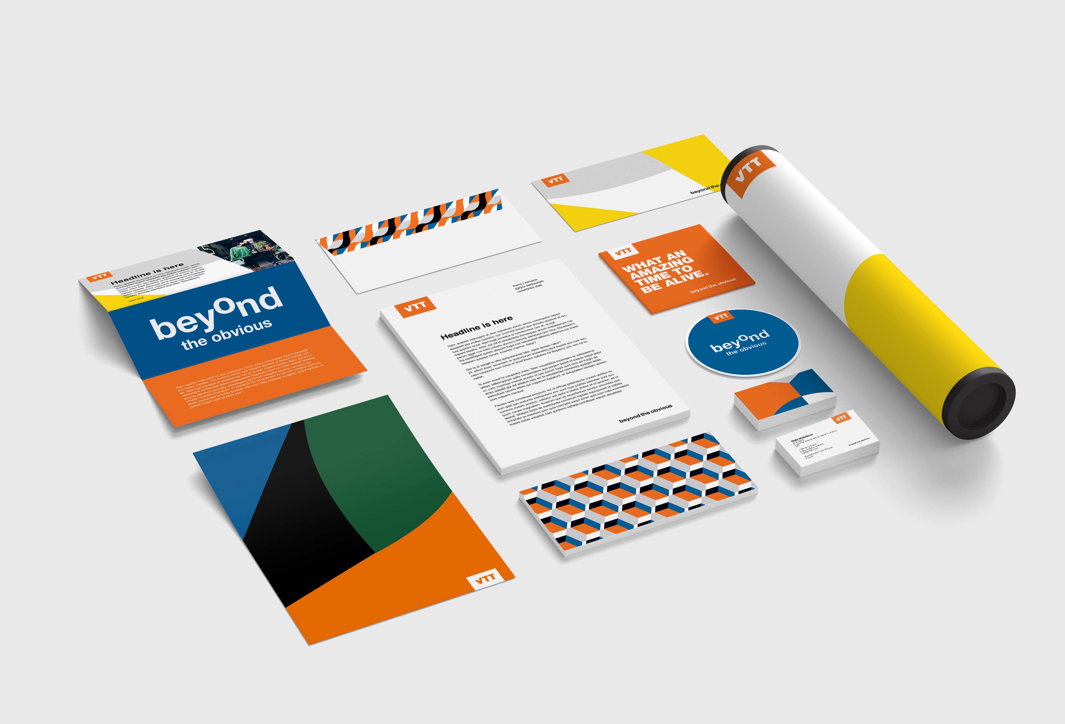
Stationery items and other office applications, including Word documents, PowerPoint files and business cards, are used across various touchpoints from internal presentations to networking and customer communications, and are therefore essential for maintaining brand consistency. White and our orange logo form the basis for our documents – patterns and images spice up the design, when necessary. Below you'll find few different layout and use case examples.
Letterhead
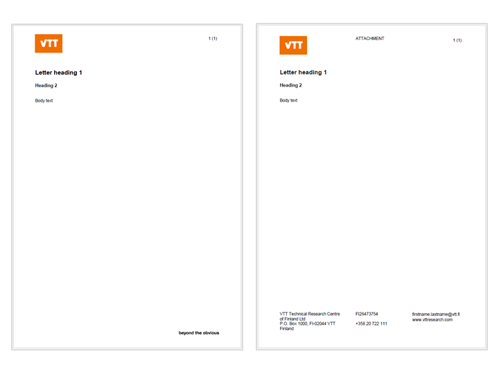
VTT's Word documents can be used as a basis for business letters, memos, and notes. Basic letterhead document is white, and includes orange logo on the top left corner and needed company information on the bottom. When company information is not needed, use simply our brand promise in the bottom right corner. Copy text is typically black.
PowerPoint presentations
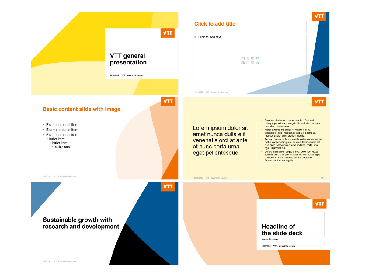
Always use the latest VTT templates, when you create VTT's presentations. There are three colour themes in the PPT-visuals: yellow, orange and blue. Choose whichever theme you like, but we recommend using one colour in one presentation.
Always prefer VTT's own images and videos over stock photos in your presentation.
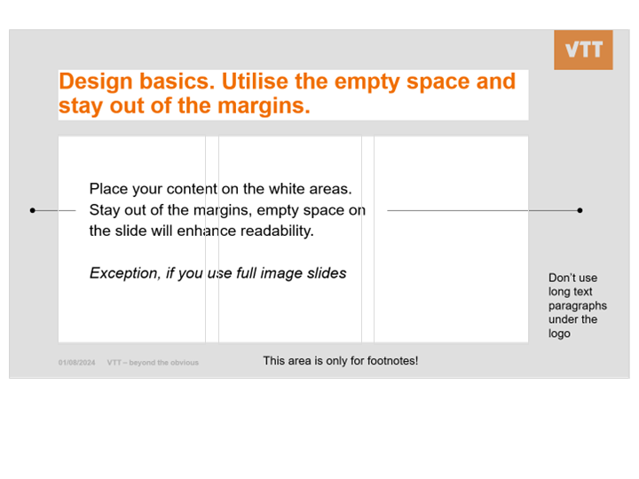
PowerPoint layout and grid
Business cards
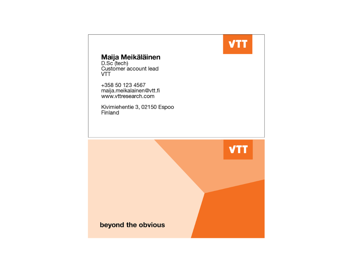
VTT's business cards are designed to make a lasting impression while maintaining brand consistency.
Our business cards are double-sided, with personal, contact and company information on the front and our orange Edge-pattern on the back. The design approach follows our simple document layout, where the main content is on a white background and the patterns bring colour to the background. The text is black, our orange logo is placed in the upper corner and brand promise in the bottom.
Office materials
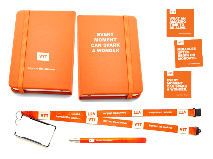
We use VTT orange and white as a basis for various office supplies, pens, brand stickers and stationery.
Office decoration
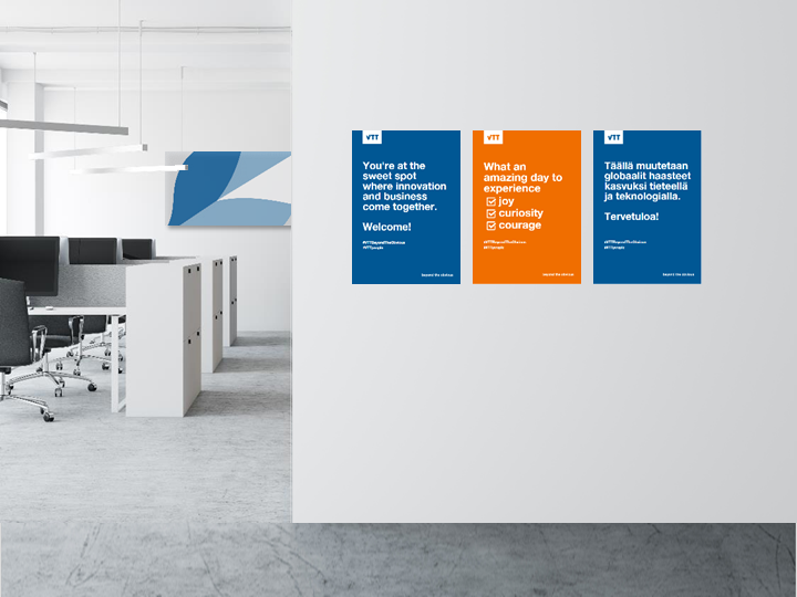
White and light colours form the basis for our interior design. Bolder colours and patterns spice up the design, and they are used as decorative elements and in details. Simple, single-colour posters can be used occasionally in seasonal campaigns.
